

The AMAT Market Cycle Clock
According to Wyckoff, the market can be understood and anticipated through detailed analysis of supply and demand, which can be ascertained from studying price action, volume and time. As a broker, he was in a position to observe the activities of highly successful individuals and groups who dominated specific issues; consequently, he was able to decipher, via the use of what he called vertical (bar) and figure (Point-and-Figure) charts, the future intentions of those large interests.
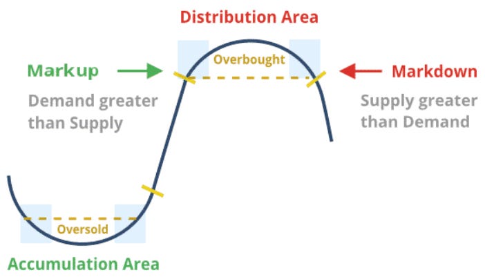
An idealized Wyckoff schematic of how he conceptualized the large interests’ preparation for and execution of bull and bear markets is depicted in the figure above. The time to enter long orders is towards the end of the preparation for a price markup or bull market (accumulation of large lines of stock), while the time to initiate short positions is at the end of the preparation for price markdown.
If we chain several of these cycles one after the other, we obtain the following wave:
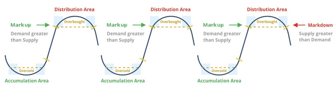
You could think about these curve as the drawing of a clock’s hand drawn over time:
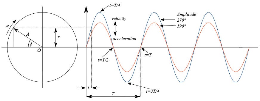
We could move forward the “bottom” part of Wyckoff’s cycle to form that clock:
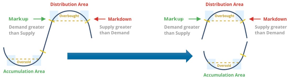
Based on the above I’ve reimagined Wyckoff’s cycle as a clock the AMAT Clock:
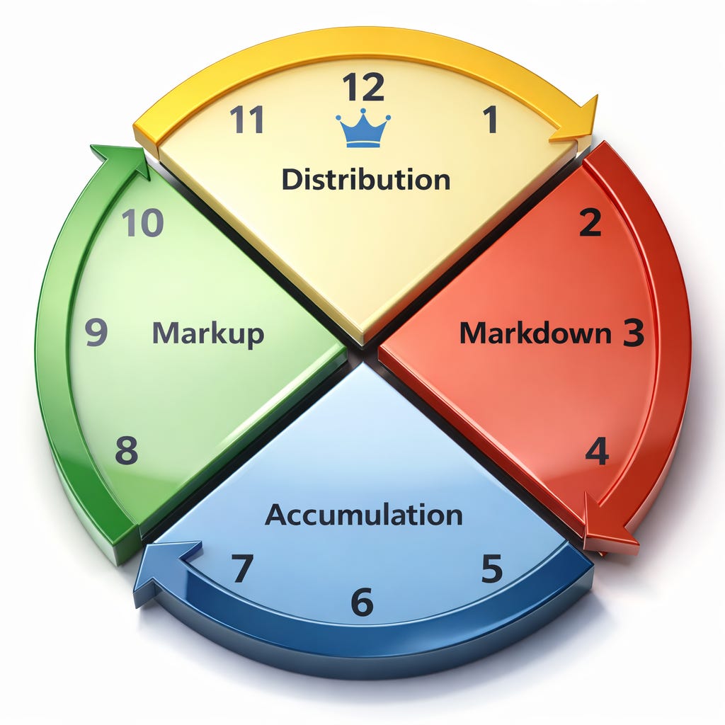
We still have 4 main quarters, rotated 45 degrees from their vertical, where each quarter corresponds with one of Wycoff’s cycle moments.
Having a clock as a reference model simplifies the communication and understanding on which moment the market is in. We can easily say that the market is at 3 o’clock, or in a Markdown, or at 9 o’clock in a Markup. It also give us the possibility to fine tune our analysis, as we can argue with another trader if our Markup analysis is more towards 10 o’clock ot towards 8 o’clock.
These 4 quadrants are also reflected in other market analysis tools, for example in the Relative Rotation Graphs (RRG) from Julius de Kempenaer. Relative Rotation Graphs, commonly referred to as RRGs, are a unique visualization tool for relative strength analysis. Chartists can use RRGs to analyze the relative strength trends of several securities against a common benchmark, and against each other. The real power of this tool is its ability to plot relative performance on one graph and show true rotation. We have all heard of sector and asset class rotation, but it’s difficult to visualize this “rotation” sequence on linear charts. RRGs use four quadrants to define the four phases of a relative trend. True rotations can be seen as securities move from one quadrant to the other over time.
The main difference between RRG graphs and AMAT’s Clock is on the position of those 4 quadrants. While in RRG charts they are vertically aligned, in AMAT’s Clock they are 45 degrees anti-clockwise rotated. This rotation aligns our clock closer to Wyckoff’s market phases. Another difference is the colors chosen for the quadrants. The ideal trade is to buy the market when it is actually going up, so before 9 o’clock but after 6 o’clock (hence green) and to sell once we have the evidence that it is going down, so around 3 o’clock (hence red). When the market is Accumulating or Distributing, we still do not have the evidence that will it go in either direction. We will allow the market to swing, between 5 and 7 o’clock when Accumulating, and between 11 and 1 o’clock when Distributing, before we enter a trade.
I hope this market analysis framework helps you to think in a more clear way about the market and its phases. I will incorporate it in my weekly analysis from now on.